If you park your homepage over at MSN, then you have been noticing some big changes to one of the most-visited websites in the world. In times when most of Microsoft is re-branding or re-building many of its products and strategies (think Windows 7, Windows Phone 7 Series, Bing, Zune HD, Windows Live Wave 4), they are not holding back over at the MSN team. Over the last couple of weeks, I have been noticing and making note of some big and not so big changes that they seem to be greatly debating internally (like background color, size of elements, text positioning, border structures, etc). For the last couple of days, probably for the ease of maintaining updated content for the Olympics, they only seem to be forwarding users to the older version of MSN.com. But a couple of weeks ago, they had almost 4 versions running:
- http://www.msn.com/ (some people are/were directed to the old version, while some were “chosen” for a version of the new version) (that’s 2)
- http://www.msn.com/preview.aspx (the permanently parked new version in progress, now without the beta sticker) (that’s 1 more)
- Another version I randomly get with some modifications to the new version design (blue background, inclusion and/or removal of an “app system”) (that’s total of 4)
I was going to go into detail about the different changes of each version, but I would first like to get an idea of what design they seem to be favoring. Right now, I have no clue about where the progression lies; in some browsers I get some versions, and on other computers I get others. I can’t tell where the preview has gone from point A to point B, so for now, just enjoy some really nice screenshots I compiled of the entire site, in its intact glory.

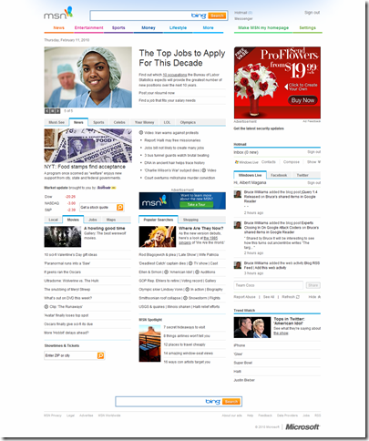
MSN.com, as it is for most users. Old design.

MSN.com Preview, first version of the new design. Well, more like ‘1.2’ pictured here because I remember that the very first preview launched did not have that blue haze at the very stop, which was a very nice touch.

Newest MSN.com design, implementing a blue background, the new apps on the right, and very awkward, unnecessary, badly positioned, marketing for Bing in the search bar. Topped off with a GIANT ‘Web Search’ button. As if we don’t what a search bar looks like. I think if they removed the orange text from inside the bar, and completely removed the button and only left the Bing logo as it is, floating right, (which could act as a button itself), it would seem very sleek.

Just thought I should add a screenshot of how they implemented the well-known “red ribbon of breaking news” within the new preview design.
Any thoughts?


0 comments:
Post a Comment